
Making your first Pinterest pin sounds simple — open Canva, add some text, done. But if you’ve ever stared at a blank canvas wondering why your pin looks nothing like the ones getting thousands of saves, this guide is for you.
The difference between a pin that gets clicked and one that gets ignored isn’t talent.
It’s knowing a handful of design decisions that take about ten minutes to learn and apply every time.
Things like which size to use, how to combine fonts so they don’t fight each other, and why that warm off-white background outperforms plain white in the feed.
This is a step-by-step walkthrough — from opening Canva for the first time to exporting a finished pin. No design experience needed, and the free version of Canva covers everything here.
In this guide, I’ll show you exactly how to create Pinterest pins in Canva, even if you’ve never designed anything before.
How to create a Pinterest pin in Canva (step-by-step)
You can use the free version of Canva for this tutorial. If you have the paid version, it just means you’ll have more choices for images, AI-generated images, and copy, and more. It’s not necessary for this exercise though.
TIP: The paid version of Canva gives you the option to automatically publish or schedule Pinterest pins in advance. It’s worth considering if building Pinterest traffic to your blog is a priority right now.
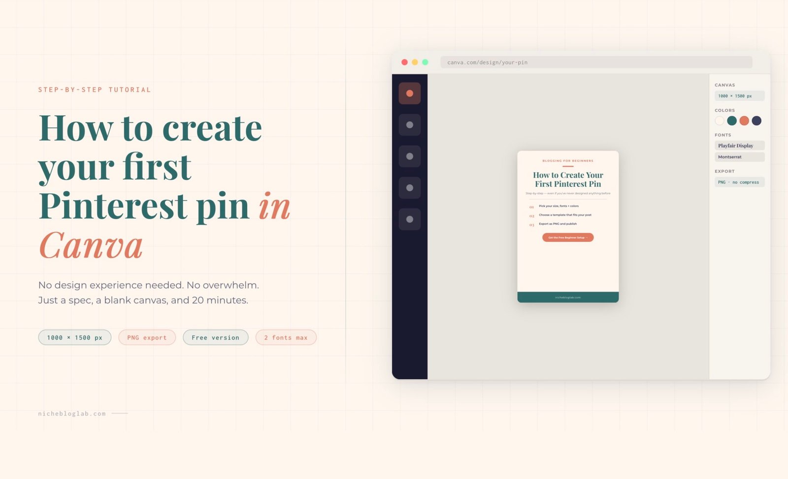
Here’s everything you need to your first pin template in Canva. Starting with how to open a blank canvas/page in Canva itself, set fonts, colors, sizes, plus layout tips, all in one tutorial.
No design experience needed.
How to create a pin:
Step 1 — Canva Setup
Go to canva.com
1. Open Canva and create a custom size
- click “Create a design”
- choose “Custom size”
- enter 1000 × 1500 px – this is Pinterest’s ideal 2:3 ratio.
TIP: You can also search “Pinterest Pin” in Canva’s template search — it’ll default to this size automatically. If it gives you options, make sure you select this size.
2. Add your fonts
Canva Pro: go to Brand Kit — add your chosen fonts and colors so they’re always one click away.
Free version: search each font name in the font picker — all fonts in this guide are available free.
3. Save your hex colors as a palette
How to do it in Canva:
- click any colored element
- click the color square
- scroll down to “Document Colors
- add your hex codes – they’ll stay saved for the entire project
TIP: Stick to 2–3 colors per pin. More than that starts to look chaotic in the feed.
4. Export as PNG, not JPG
How to download in Canva:
- click Download
- choose PNG
- uncheck “Compress file”
TIP: PNG KEEPS YOUR TEXT SHARP. JPG CAN MAKE TEXT LOOK BLURRY AT SMALL SIZES ON MOBILE.
5. Always add your blog URL
Place your URL in small text at the bottom of every pin.
This tactic does two things:
- It protects your image if it gets re-shared without a link.
- It reinforces your brand in the feed.
Step 2 — Choose Your Color Palette
The Pinterest-proven color palette
These colors are drawn from Pinterest’s own research on high-performing pins:
Warm neutrals, coral/red, deep teal, and navy consistently outperform trendy or overly bright palettes.
| Color Name | Hex Code | Best Used For |
|---|---|---|
| Terracotta Coral | #E07A5F | CTAs, accents, freebies |
| Pinterest Red | #C1121F | Free download pins, bold CTAs |
| Deep Teal | #2D6A6A | List pins, dark backgrounds |
| Light Teal | #81C9C9 | Accents on dark teal pins |
| Deep Navy | #1B2A4A | Stats pins, authority feel |
| Dark Slate | #3D405B | Problem/Solution, quote pins |
| Warm Off-White | #FDF6EE | Light backgrounds, step-by-step |
| Soft Blush | #FFF0EB | Before/after, neutral layouts |
| Warm Amber | #C17A3A | Tutorial pins, step numbers |
| Pure White | #FFFFFF | Clean minimal layouts |
Step 3 — Pick Your Fonts
The Font Guide
Use a maximum of two fonts per pin.
Pair a ‘personality’ font (serif or display) for headlines with a clean font (sans-serif) for body text.
All fonts below are available free in Canva.
| Font Name | Use For | Style | Available In Canva |
|---|---|---|---|
| Playfair Display | Headlines, quote pins, editorial feel | Serif, elegant | Free |
| Montserrat | Labels, URLs, eyebrows, CTAs | Sans-serif, clean | Free |
| Raleway | Bold headlines, freebie pins | Sans-serif, geometric | Free |
| Lora | Pull quotes, italic accents | Serif, literary | Free |
| Merriweather | Tutorial / step-by-step headlines | Serif, readable | Free |
| Oswald | Big numbers in stats pins | Condensed sans, bold | Free |
| Open Sans | Body text, list items, descriptions | Neutral, highly readable | Free |
Step 4 — Choose Your Template
Here are ten template formulas. Each one contains a font, colour and layout spec combo that you can follow to create click-worthy pins.
Keep this table as a go-to spec guide whenever you design pins in Canva.
| # | Template Name | Background | Fonts | Best For |
|---|---|---|---|---|
| 01 | Warm Coral Headline | White | Playfair Display + Open Sans | Benefit-driven posts with a photo |
| 02 | Deep Teal List | Deep Teal #2D6A6A | Playfair Display + Open Sans | Numbered lists, “7 ways to…” posts |
| 03 | Warm Neutral Steps | Warm off-white #FDF6EE | Merriweather + Montserrat | How-to guides, tutorials |
| 04 | Clean White Quote | White | Lora Italic + Montserrat | Quotes, tips, brand authority |
| 05 | Bold Red Freebie | Pinterest Red #C1121F | Raleway ExtraBold + Open Sans | Lead magnets, free downloads |
| 06 | Soft Blush Before/After | Blush #FFF0EB | Playfair Display + Open Sans | Transformation/comparison posts |
| 07 | Dark Navy Stats | Deep Navy #1B2A4A | Oswald + Raleway + Open Sans | Data, statistics, research posts |
| 08 | Clean White Text-Only | Near-white #FAFAFA | Playfair Display + Lora + Open Sans | Opinion posts, strong headlines |
| 09 | Slate + Coral Problem/Solution | Slate #3D405B + Coral #E07A5F | Lora Italic + Raleway Bold | Pain-point led, SEO/traffic posts |
| 10 | Dark Editorial Photo | Dark #1A1209 + photo overlay | Playfair Display + Montserrat | Income posts, behind-the-scenes |
Step 5 — Apply These 10 Design Rules That Drive Pinterest Clicks
Use 2:3 ratio always
1000 × 1500 px is Pinterest’s sweet spot. Longer pins (up to 1:2.1) still work, but anything beyond that gets cut off in the feed.
Max 2 fonts per pin
One headline font + one body font. More than two and your pin starts looking chaotic on a 5-inch screen.
Lead with the benefit
“7 Blog Income Streams” beats “Blogging Tips.” Specific outcomes and numbers consistently outperform vague titles.
Make text readable at thumb size
Pinterest is mostly mobile. If you can’t read your headline when the pin is the size of your thumb, it needs to be bigger or bolder.
Use warm neutrals, not harsh white
Off-whites (#FDF6EE, #FFF0EB) feel more premium than stark white and stand out better in a feed full of white pins.
Red and coral are your CTR friends
Pinterest’s own data shows red and warm coral tones consistently drive more clicks. Use them on CTA buttons and key accents.
Create 3–5 pins per post
Don’t make one pin per article. Create variations — different templates, headlines, and color schemes. Fresh pins = more impressions.
Always add your URL
Small, bottom-corner, every single pin. It protects your content if it gets re-pinned without a link attached.
Pair an italic serif with a bold sans
Lora Italic + Montserrat Bold, or Playfair Display + Open Sans — this pairing is one of the best-performing combinations on Pinterest.
Export as PNG, not JPG
PNG keeps text crisp at small sizes. JPG compression can blur your headline on a mobile screen, which kills CTR.
The one thing to keep consistent while you get creative
Once you have your first pin done, the temptation is to start experimenting — different layouts, different vibes, different everything. That’s actually the right instinct, but there’s a distinction worth locking in early.
What stays the same, every single time:
- Canvas size: 1000 × 1500 px
- Maximum two fonts (your chosen pair, not a new pair each time)
- Your saved hex palette (the same 2–3 colors)
- PNG export, compression off
- Your blog URL, bottom of every pin
What you’re free to vary:
- Background color (swap between your palette colors)
- Headline copy and angle
- Whether you lead with text or an image
- Layout — text top, text bottom, centered, split
This is the system that makes Pinterest work over time. Your audience starts to recognize your pins in the feed before they even read the headline — because the colors, the type, the overall feel is consistent.
Creative variation is how you test what resonates. Spec consistency is how you build a brand.
Conclusion
Your first pin doesn’t need to be perfect. It needs to be finished, exported as a PNG, and live on Pinterest — because that’s the only version that can start working for you.
What you have now is a repeatable system.
Lock in the specs (size, fonts, palette, URL), then let yourself play within them. Make three to five pins per post — same spec, different headline, different color from your palette, different layout.
That’s not inconsistency. That’s how you test what your audience responds to, without starting from scratch every time.


