There are thousands of Pinterest templates inside Canva. Most of them look great in a mockup. Most of them will do nothing for your traffic. That’s not a Canva problem. It’s an evaluation problem. When you’re scrolling through templates, you’re making a visual judgment — does this look nice? — when you should be asking a completely different question: is this built to drive clicks? Those are not the same thing.
I’ve spent a lot of time building and testing Pinterest pin formats for this blog — including the 10 Pinterest Pin Templates tool and the Canva Pinterest Pin Spec Sheet I created specifically for bloggers.
What I learned in that process is that the templates that perform well aren’t the prettiest ones. The ones built around a specific set of structural decisions are.
Here are the 5 features I now look for every time I evaluate a Canva Pinterest pin template — and the ones I built my own templates around:
1. It’s Built on a 2:3 Ratio (1,000 × 1,500 px)
This is the baseline. If a template isn’t set up at this dimension, it’s already working against you before you’ve typed a single word.
Pinterest’s ideal pin ratio is 2:3. At 1,000 × 1,500 px, your pin displays fully in the feed — no cropping, no compression, no awkward white bars. The moment you go outside this ratio, you’re either getting cut off at the bottom or leaving dead space that makes your pin look unfinished.
The good news: if you search “Pinterest Pin” in Canva’s template search, it defaults to this size automatically. The risk is when you’re pulling templates from third-party sources, or repurposing a general social media template — those are often set to 1:1 or 4:5, neither of which performs well on Pinterest.
Before you customise anything, check the dimensions first. It takes five seconds and it’s the single most common mistake I see bloggers make.
💡 In the Canva Pin Spec Sheet, this is Step 1 for a reason. Get the canvas right, then design.
2. It Uses a Maximum of 2 Fonts — One Headline, One Body
Pinterest is a mobile-first platform. Most of your audience is scrolling with a thumb, looking at pins roughly the size of a playing card on their screen.
At that scale, visual noise is fatal.
A template that uses three or four fonts — a display font for the headline, a script for the subheading, a sans-serif for the body, and something else for the URL — looks chaotic before the reader has processed a single word. By the time their brain sorts out the visual hierarchy, they’ve already moved on.
The rule I follow, and built into all 10 of my NBL pin templates: one headline font, one body font. That’s it.
The pairings that consistently work on Pinterest:
- Playfair Display + Open Sans — editorial, authoritative, works for almost any blogging niche
- Lora Italic + Montserrat Bold — warm and readable, great for quote and tip pins
- Raleway ExtraBold + Open Sans — bold and geometric, high-impact for list pins and freebies
- Merriweather + Montserrat — trustworthy and structured, ideal for tutorial-style content
All of these are available free in Canva. You don’t need Canva Pro to access good typography — you just need to be intentional about it.
If a template you’re looking at has more than two fonts in play, edit it down before you start customising copy. The design will be stronger for it.
3. The Layout Leads With a Benefit or a Number
A pin template is a frame. But it’s a frame designed to carry a specific type of content — and the best templates are built with the hierarchy already solved.
What that means in practice: the headline should be the dominant element. Large. Top-weighted or centre-weighted. Impossible to miss at thumb size.
And that headline slot should be built to carry a specific kind of message: an outcome, a number, or a clear promise.
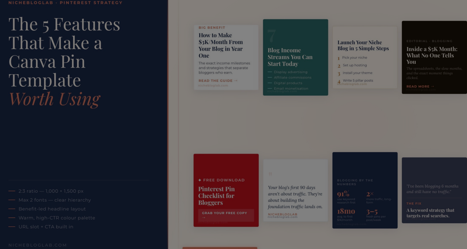
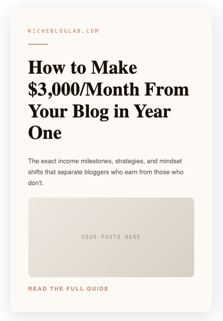
Look at how my Big Benefit Headline template is structured — the headline is the pin. Everything else (the subhead, the CTA, the URL) is supporting material. The layout physically enforces the hierarchy so you can’t accidentally bury the lead.
Compare that with a template where the brand logo is the largest element, or where the headline is a small centred line sandwiched between decorative elements.
That template is optimised for brand presence, not for clicks.
The question to ask: if I covered everything except the headline, would someone know exactly what they’re getting if they clicked? If the answer is no, the layout isn’t doing its job.
Numbers are particularly powerful here.
“7 Blog Income Streams” consistently outperforms “Blog Income Streams.”
“How to Make $3,000/Month” consistently outperforms “How to Make Money Blogging.”
The specificity is a trust signal — it tells the reader you know something concrete, not just something general.
4. It Uses a Warm, High-CTR Colour Palette
This one surprises people, but the data is consistent: colour choice directly affects click-through rate on Pinterest, and trendy palettes are not the same as high-performing ones.
Pinterest’s own research — which I referenced when building the colour palette for the Canva Pin Spec Sheet — shows that warm neutrals, coral/red tones, deep teal, and navy consistently outperform cool-toned, neon, or overly trendy palettes.
The colours I use across my 10 templates, and why:
| Colour | Hex | Best Used For |
|---|---|---|
| Terracotta Coral | #E07A5F | CTAs, accents, freebie pins |
| Pinterest Red | #C1121F | Lead magnets, bold CTAs |
| Deep Teal | #2D6A6A | List pins, dark backgrounds |
| Deep Navy | #1B2A4A | Stats pins, authority feel |
| Warm Off-White | #FDF6EE | Light backgrounds, tutorials |
| Soft Blush | #FFF0EB | Before/after, neutral layouts |
Notice what’s not on that list:
harsh white (#FFFFFF as a background), bright yellow, neon anything, or the particular shade of sage green that was everywhere in 2022–2023.
Those might look current in a mood board. They don’t tend to drive clicks.
If a template you’re evaluating uses a palette that feels very “of the moment” — trending colours from Instagram or brand design — proceed with caution.
Pinterest rewards warmth and clarity over trendiness.
One specific thing to watch: off-white backgrounds outperform stark white.
In a feed full of white pins, a warm off-white (#FDF6EE or #FFF0EB) actually stands out more, and it reads as more premium. It’s a small distinction with a real impact.
5. It Has a Clear Slot for Your URL and CTA
This is the feature most bloggers don’t think to look for — and it’s the one that makes the difference between a pin that drives traffic and a pin that just gets saved.
Every click-driving pin needs two things baked into the layout:
- Your domain URL — small, bottom corner, every single pin
- A CTA — even a simple arrow or “Read more →” counts
The URL matters more than most people realise. Pinterest content gets re-pinned, screenshotted, and re-shared in ways that often strip the original link. A URL embedded directly into the image is your protection — it travels with the content even when the link doesn’t.
The CTA matters because Pinterest users are trained to look for a direction. A pin that ends visually without a next step leaves the reader’s eye with nowhere to go. Even a minimal “→” at the bottom gives the composition a conclusion and the reader a prompt.
Look at my Freebie / Lead Magnet template — “Grab Your Free Copy →” is a core structural element, not an afterthought. The CTA is built into the layout at the design stage.
If a template doesn’t have a designated URL zone or a clear CTA area, you’ll end up retrofitting both in — and they’ll look like they were added later, because they were. A well-built template has space for these from the start.
How the NBL Templates Are Built Around These Features
When I built the 10 Pinterest Pin Templates for NicheBlogLab, each one was designed to embody one or more of these features in a specific way.
Here’s how they map:
| Template | Key Feature It Demonstrates |
|---|---|
| Big Benefit Headline | Feature 3 — outcome-led layout, number-driven headline |
| List / Number Pin | Feature 3 + Feature 4 (deep teal, high contrast) |
| Step-by-Step | Feature 2 — clean font hierarchy, structured layout |
| Freebie / Lead Magnet | Feature 5 — CTA-first, URL-embedded design |
| Stats / Data Pin | Feature 4 (deep navy) + Feature 3 (numbers as the lead) |
| Minimal Text-Only | Feature 2 — typography doing all the work |
| Quote / Tip Pin | Feature 2 + Feature 4 (minimal dark, brand voice) |
| Before / After | Feature 3 + Feature 4 (warm neutral palette) |
| Problem / Solution | Feature 5 + Feature 4 (slate + coral, empathy-led) |
| Editorial Photo + Text | Feature 3 + Feature 5 (curiosity headline + clear CTA) |
Every template is also set to 1,000 × 1,500 px out of the box — Feature 1 is non-negotiable, so it’s just built in.
The accompanying Canva Pinterest Pin Spec Sheet gives you the full technical breakdown for recreating all 10 in Canva — fonts, hex codes, layout tips, and the 10 design rules I follow every time I build a pin.
The Short Version
Whenevaluating a Canva template — whether you found it in Canva’s library, bought it from a third party, or built it yourself — run it through these 5 checks:
- Dimensions — is it 1,000 × 1,500 px (2:3)?
- Typography — does it use max 2 fonts with a clear hierarchy?
- Layout — does the headline lead with a benefit, outcome, or number?
- Colour — is the palette warm and high-contrast rather than trendy?
- Conversion elements — is there a dedicated URL slot and a CTA?
If a template passes all five, it’s worth customising. If it fails more than two, move on — you’ll spend more time fighting the layout than designing the pin.
A good template doesn’t just look nice. It does half the conversion work before you’ve written a single word.
Conclusion – The 5 features, one more time
A good Canva template isn’t just a pretty frame.
It’s a structure that’s already done half the conversion work before you’ve written a single word.
Run every template you. evaluate through these five checks:
- the right canvas size,
- a clean two-font hierarchy,
- a benefit-led headline slot,
- a warm high-CTR palette,
- and a built-in space for your URL and CTA
Pass all five and you have a template worth building on. Fail more than two and you’re fighting the layout instead of designing the pin.
Stop designing from guesswork. Use what’s already built to work.
Something extra:
The Spec Sheet tells you how to build the pin. The Copy Vault gives you what to write on it — 25 fill-in-the-blank headline formulas across all 10 pin template types, with 50+ examples written for bloggers and the conversion psychology behind each one.It’s free. It’s a PDF. And it’s the thing I wish I’d had every time I sat down in Canva with a blank pin and no idea what to say. Get the Pinterest Pin Copy Vault →
Want templates already built to these specs? The NBL Pinterest Pin Templates tool has all 10 formats ready to reference, and the Canva Pinterest Pin Spec Sheet gives you everything you need to recreate them. If you’re newer to Pinterest design, start with the 10 Pinterest Pin Templates That Get Clicks post — it walks through each format with copy examples you can use straight away.


